Project
Homepage Templates
West Elm · Digital Design System
Hypothesis 💭
If a modular set of homepage components are developed with and are accessible to cross-functional partners, then asset design time will decrease, digital marketing flexibility will increase (thus increasing conversion rates), and asset redeliveries due to human error (rather than promotional changes) will decrease.
Goals
Create a cohesive homepage design system out of modular components, large enough to cover a variety of promotional and cross-brand business needs for desktop and mobile.
Modules must work within the column parameters of West Elm's ECM (Enterprise Content Management system).
Module nomenclature must meet cross-functional prerequisites — structured within the master Sketch document to match the pre-existing server organization, delineate between structural and delivery modules, and include hierarchical naming cues (Primary, Secondary, Tertiary) for marketing and digital merchandising teams.
Modules must be accessible for reference to cross-functional teams without Sketch licenses.
Module type lockups must be specified with character counts for headers, sub-headers, and body copy.
Document workflow for the design team and onboarding reference.
Desktop Template
Modular homepage components built for desktop layouts.
Mobile Template
Responsive modules adapted for mobile viewport constraints.
Methods 🗂️
I, along with my Art Director, Creative Director, and cross-functional partners, audited year over year homepage use cases to account for the successful design implementation of large business driving annual promotions as well as successful core, day to day, design assets.
Was a previous asset successful because it was well designed? Or can the conversion increase from the previous year be attributed to its relative position around other promotions that may have varied year over year? Questions like these were important to answer cross-functionally so that we incorporated designs that were successful by virtue of the design itself.
The homepage templates were built in Sketch and modeled on the software's system of symbols and nested symbols. In addition to the template redesign, documentation was imperative. In order to optimize workflow, file organization, and onboarding, I compiled a detailed Confluence document for the newly designed templates.
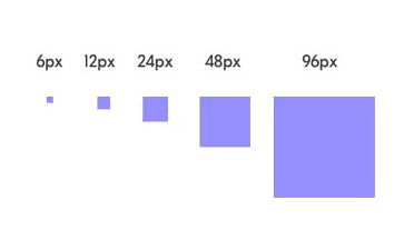
Desktop padding system

Mobile padding system
Conclusion
Digital marketing and design flexibility increased and design-time per asset decreased as hypothesized. However, overall design time increased due to the overall increase in design change requests as a result of the increased flexibility.
Initially, redeliveries due to human error decreased as expected, however, the increase in overall design change requests had a negative effect on the overall redelivery decrease.
Cross-team confusion surrounding briefing and product imagery decreased dramatically as design wireframe visibility increased for cross-functional partners.
Living Document
Due to ever-evolving business needs and constant refinement, the homepage templates were designed to be a living document. After our initial redesign, several more updates and partial redesigns occurred incorporating updated brand typestyles and site-wide padding styles.